Transportation · 5311 demand response, Medicaid, fixed route
Your whole operation, on one login.
Cutaways and vans, demand response at the core, Medicaid brokers, fixed routes. Every number a rural transit director answers for — trips, runs, no-shows, on-time, cost per trip tied to the ledger — every county, every month. Keep your scheduling system; Flagstop works from the exports it already makes.
Built in a transportation office. It shows.

Flagstop was built by someone who files these reports — the state monthly checklist, the federal transit report, the month close — and who answers for the numbers in front of a board. A manager with a little curiosity can pull answers out of it all day: which runs, which counties, which months, which accounts. Every answer arrives with its definition and its denominator.
The pages are grouped the way a transportation office thinks. Operations carries trips, runs, service quality, no-shows and trip purpose against the goals leadership sets. Admin lays expenses and revenue out month by month and account by account — the ledger, the local-match position, cost per trip, who paid. Fleet, drivers, counties and peers sit beside them. Reporting is the mobility manager's own tab.
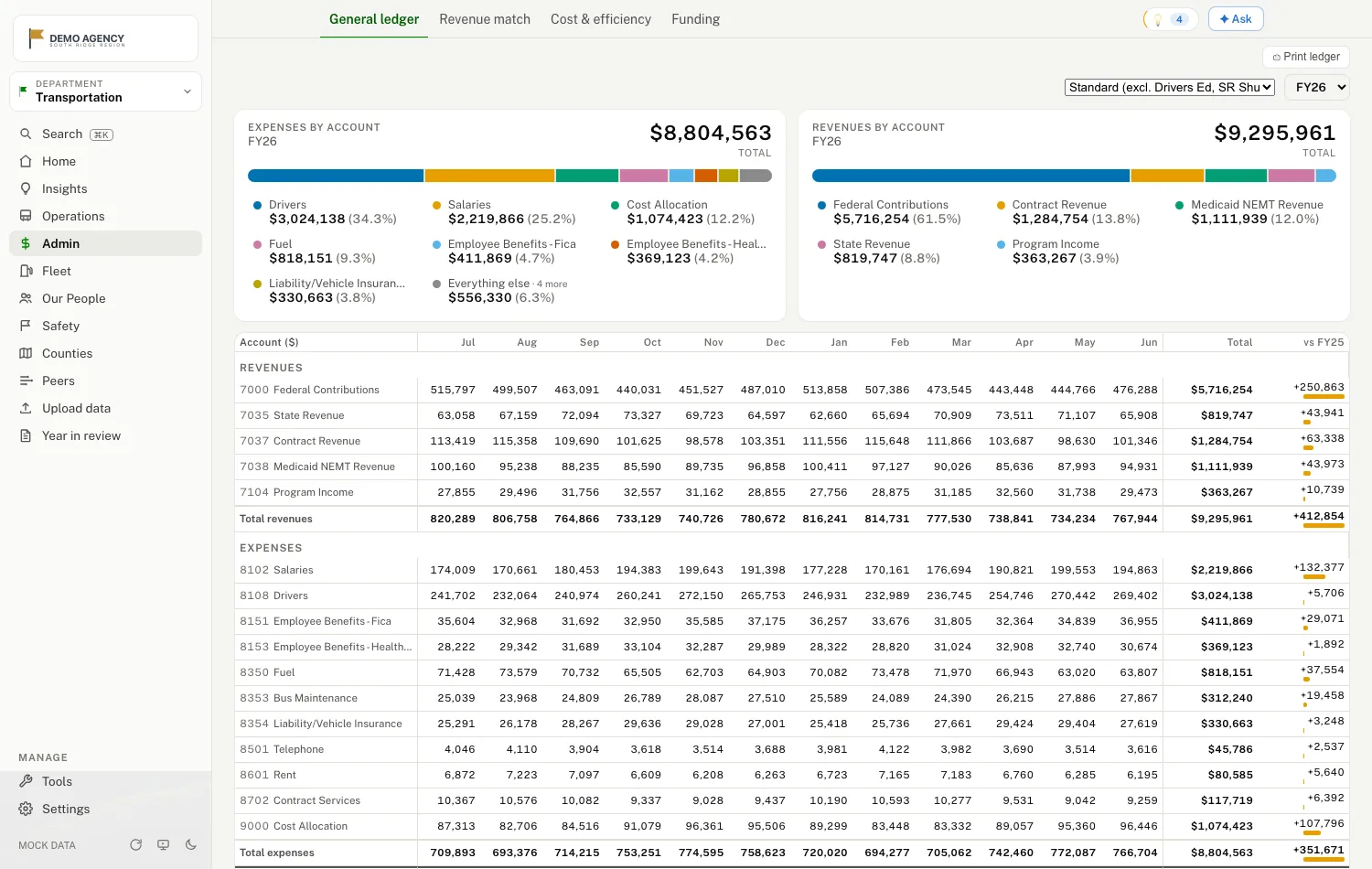
Cost per trip that ties to the ledger
Dollars come from your books, quantities come from operations, and the two meet on one page: cost per trip, per mile, per hour — by service, month over month, year over year on the same window. Your chart of accounts and your program groupings are mapped once during onboarding, so the money pages speak your finance office's language. When the board asks why cost per trip moved, you answer with the ledger, not a hunch.
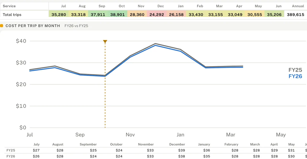
Where the winter goes
Every year, trips peak in October, drop from November through January, and come back in February. Cost per trip rises in the same three months while the hours run flat — the operations count and the ledger's dollars, reconciled on one screen. It's obvious the moment someone looks. Flagstop makes the looking a click.
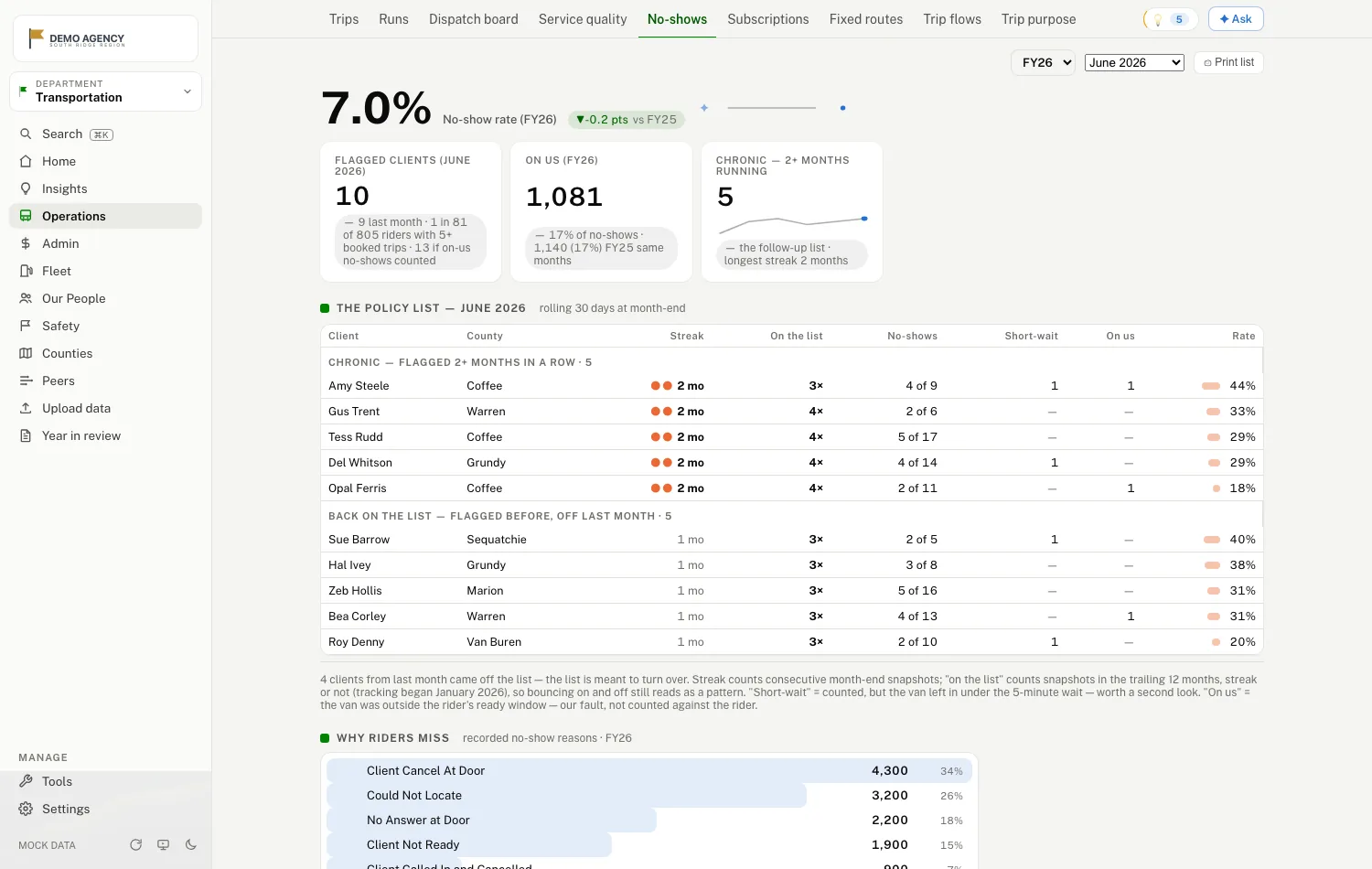
Your no-show policy, running itself
If your rule flags any rider who misses more than 20% of booked trips in a rolling 30 days, that's exactly what the page shows — the current list, with streaks and history, short, fair, and impossible to ignore. Every no-show is judged against the window the rider was told, so a driver who came early or late counts against the agency, not the rider. The reasons riders miss are ranked, so you fix causes, not symptoms.
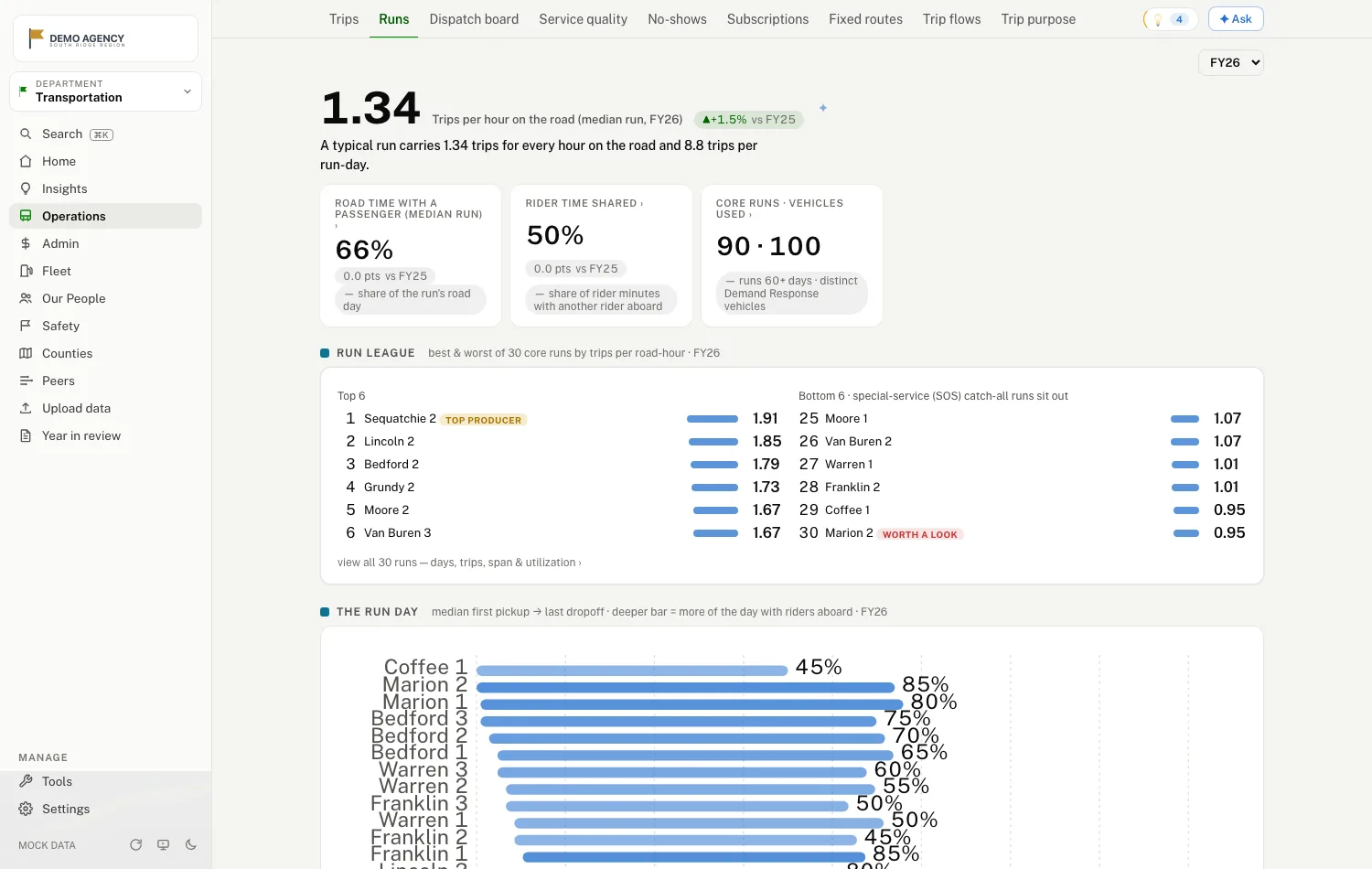
Which runs earn their keep
A league of every core run by trips per road hour — time actually on the road — best and worst, with utilization, spans and occupancy behind each one. "If I cut the least productive runs and reinvested the savings, where would I look?" stops being rhetorical. The floors — how many days make a run worth ranking — are set to your standards during onboarding, so no run gets condemned on noise.
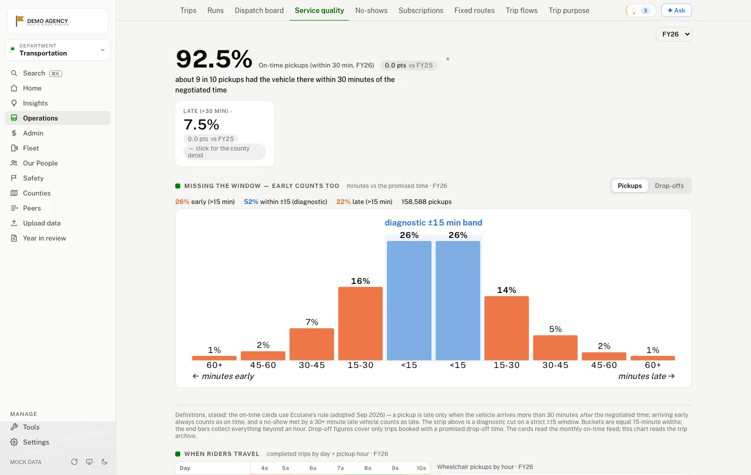
On-time, by your own rule
During onboarding we sit with your ops team and pin down how your department calls a pickup on-time — within 15 minutes of the promised window, or whatever your standard is — and that one rule populates every on-time number on every page, with the pickup count behind every rate. When two reports disagree, the argument is short: your definition is printed at the bottom of the page.
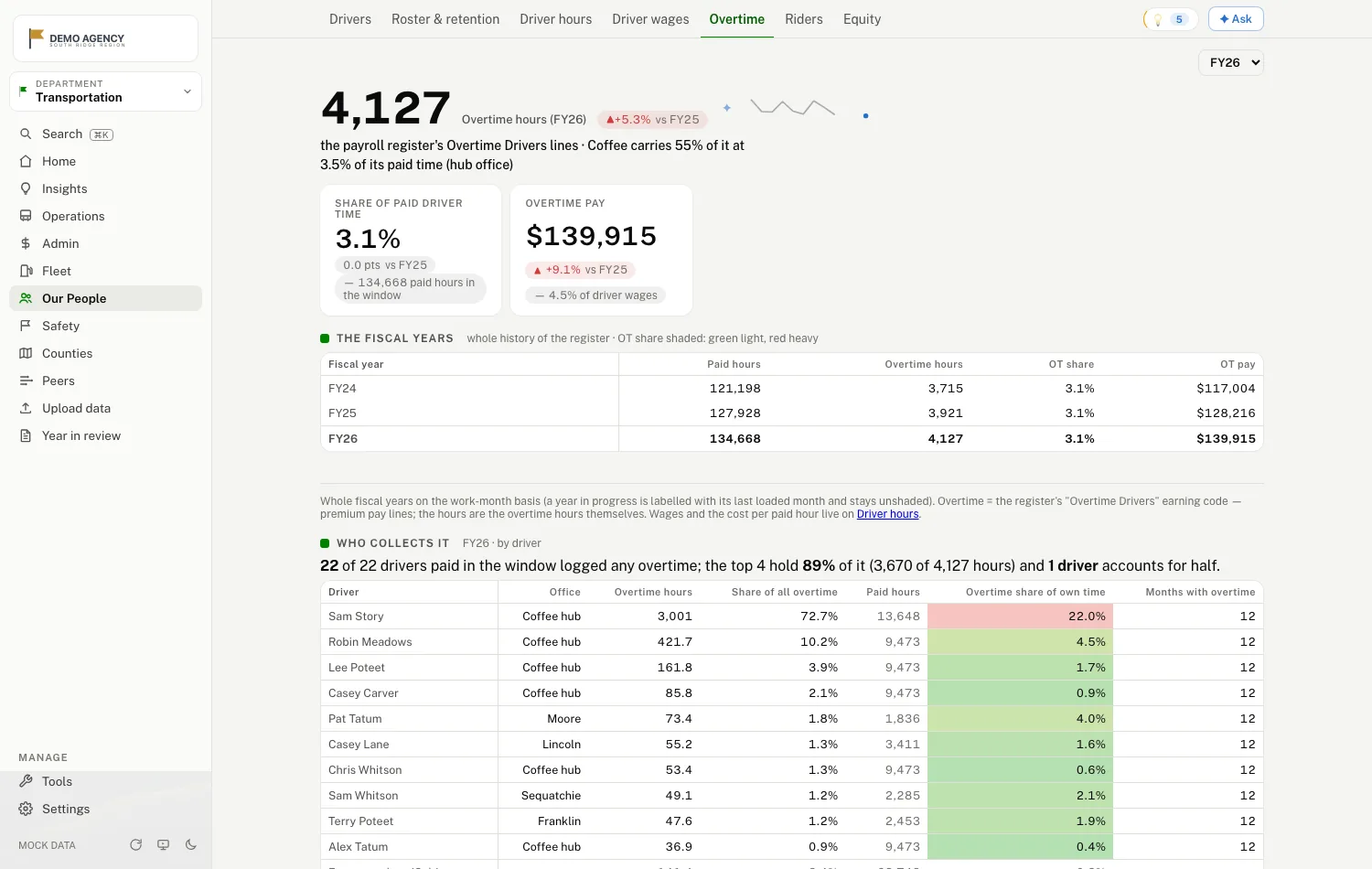
Drivers, hours, and overtime
Paid hours from payroll, on-road hours from operations, vehicle hours from the monthly sheet — three figures, side by side, each labeled for what it is. Overtime from the payroll register: where it concentrates, what share of paid time it takes, how this year compares. Plus rosters, retention, and driver wages by month.
And the rest of the operation

- Fixed routes, stop by stop — boardings by route and stop, drawn on the town map.
- Reporting — the state's monthly checklist computed with every definition printed, and the annual NTD report started as a draft, not a blank page.
- Trip flows — where riders actually travel, county to county.
- Fuel, fleet and maintenance — dollars per mile, vehicles in service, gallons; the ledger's maintenance dollars by vendor, shop against outside vendors, per service mile.
- Standing orders — the share of trips on a subscription, and the vehicle time they leave on the schedule.
- Roster, retention and wages — who's driving, who's new, who stopped.
- Safety — incident patterns by kind, county, and month.
- Peers, as filed — your figures beside the other systems in your state on the public federal data.
- ✦ on every number — press it and the assistant explains the figure using only what the page shows.
Transportation is one department of the dashboard. The same login carries the whole agency — the ledger, community services, every county — from the files the agency already has.
See it for yourself.
A fictional agency, synthetic data, no login, nothing to install. Land on transportation, open cost per trip, press a ✦, then look at the winter.
Explore the live demo → Talk to us
Transportation home Trips Cost per trip, with its ✦ No-shows Runs On-time The state monthly report
↗ Opens in a new tab — this page stays open behind it.